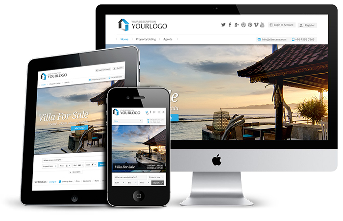
Being fully responsive, WPL 28 automatically adapts to different screen sizes. Not only the template, but also FlexSlider and all other elements of the template are responsive, too. It keeps the design clean in different sizes and resolutions of big or small displays of tablets, computers, cell phones etc. Your website will not mess up in any device with any resolution.